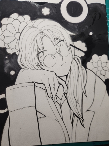
Describing my art progress in detail with pictures seemed fun to be after putting some effort into character art! If you’ve ever wanted to make crappy art like me, you’re in luck!!! :D In all seriousness, this isn’t a tutorial. I just draw for funsies, so feel free to critique anything about all of this! I’ll also talk about my supplies.
I am a VERY messy person, so my “process” is messy. Usually I make mistakes at some point and try to fix them lol. Sometimes I get tired and smear in paint with my fingers at the end. Part of the fun of traditional art is embracing all of the mess and textures and unpredictable things you can’t change. At least for me ^^;; There’s a saying in crochet circles that says that at least one mistake in your work is good luck or something along those lines. I like that mentality and while I try to minimize mistakes, I also know they make me human : )
So usually when I have the urge to draw something, I will have an idea or concept in my head that I think about for a couple days maybe. Sometimes I just want to draw a character, but I have no idea how to go about it. In this example, I knew what character I wanted to draw, but I came up with a few poses first before confirming. If it didn’t work out, recently I default to Pretty Cure characters.
ANYWAYS, step one of my process is taking a picture of myself with a pose. I usually just do this with my smartphone and the timer setting. Oftentimes the pose isn’t one-to-one at all, but I like using a reference of myself for hands especially. I do not trace over the picture. I then usually decide if I want to paint with watercolors or go with markers. I chose watercolors today, so watercolor paper it is. I sketched and erased directly onto the paper. You can see in my sketch how I’m erasing the ginormo hand and trying to make it look human-like in size. (Thank you friends for the feedback U_U)
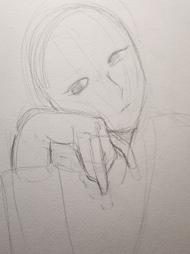
Okay so after I drew for a bit, I went forward with the character I had in mind, Souichi Tatsumi from Koisuru Boukun. You should read that if you like the BL genre; it’s really good! I’ve been enjoying the manga lately. Alright so here is when I starting sculpting out the anatomy (I really need to actual anatomy…) and the character traits. Souichi has long hair, circle glasses, a lab coat, and usually a violent / grump disposition. He usually wears a button down shirt. Here I wanted him to look kind of reflective and prettier.
By the way, I have my laptop in front of me while I’m sketching and I’m togging between official artwork of the character by this point. I also look at my own reference pose to make sure my art doesn’t get too off track. Sometimes I reference art styles I really really like and how they would draw certain things.
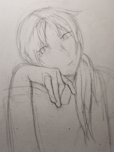
I continued to add to his features with his coat, glass, hair, etc. I think the “spider hands” helped give shape to his fingers.
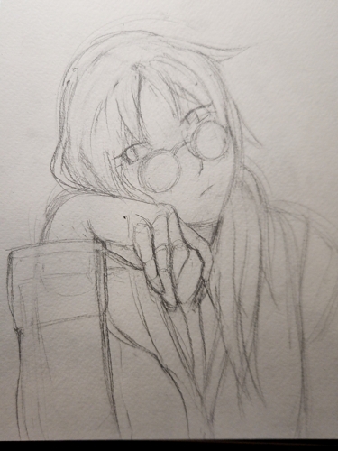
Time to ink. Here I used the 0.2 mm Sakura Pigma Micron ink pen to ink the lines. I use Micron pens because they are:
I attempt to keep a relaxing hand and enjoy mindlessly inking in the lines, erasing as I go.
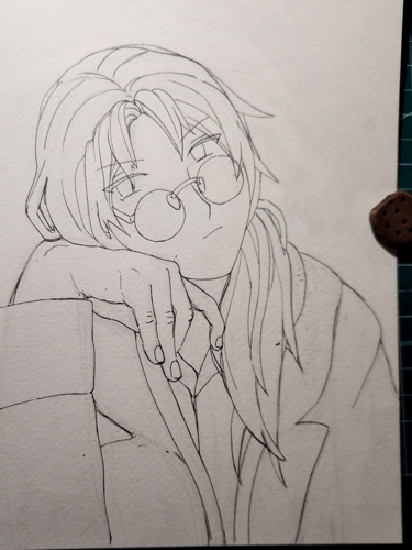
This picture looks really off with the same line width. I now go back and thicken the lines with the other Microns and *checks Google* a Copic Gasenfude Brush Pen. This is a nice quality black fude pen that’s not too pricey and safe for watercolor / alcoholic markers. I might have overdone the line thickness honestly, but I was trying to absolutely make sure the the hand looked the closest to the viewer with the thick lines. Here’s the all of the chonky lines. Reminds me of Danganronpa art a little lol
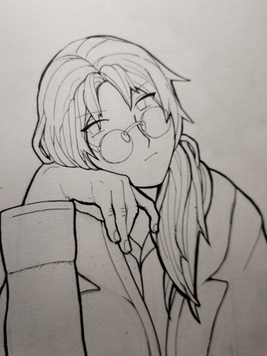
Okay, so at this point, we are done with the ink and need to start mentally and physically (?) transition to color. I also start really thinking about the background here too. I am a huge sucker for BLACK backgrounds, especially since I have a bad habit of using too light values without it. My inspiration was also the second tankobun cover for Koisuru Boukun. I remember seeing it and thinking “wow! that’s so pretty”. I wanted to do a little homage to that.
At this point, I have tabs open with the Souichi references and the cover. I look at Souichi’s color scheme. Souichi originally had gray hair which evolved into beige blonde hair. He wears a white lab coat. In art with the beige hair, his skin is darker than his hair.
So the black background was a no-brainer for multiple reasons. The second cover has these really really pretty flowers in bright colors which I wanted to incorporate. I drew some shoujo bubbles in a way that would guide your eye through the art (or at least tried to) and then turned them into flowers and “doughnuts”. The doughnuts weren’t there in the cover, but I thought it would be fun and abstract. Also since we’re black out the background, I used some Sharpies to make a buffer zone against the objects in the picture.
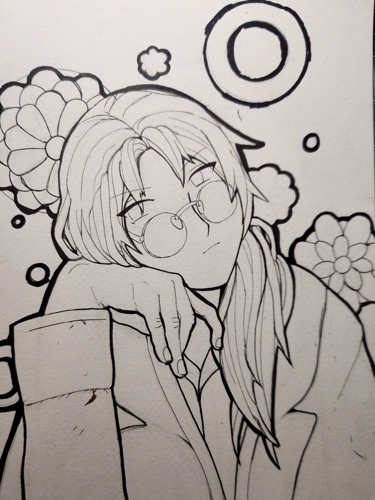
Alright, so what are we using to black out everything?? I don’t want to use super expensive ink. I like using Sharpies, but they have a distinct texture and color.
I used the BLACK 2.0 paint from Stuart Semple. A very long time ago I got some Stuart Semple powders and paints to have the ~blackest black~ in my hands. This paint is very old. Probably 7-9 years old. I REALLY recommend it though. It’s extremely matte, black, and you only need a little bit. You do not need two layers in most cases. It’s really really black. You can dilute it with water to make it more watercolor-like. This is what I did and you can see how black it is. I’m sure you can use this for line art and ink too.
So changed my clothes and blacked out everything with the turbo black paint. It was a lot of fun. I diluted with water. I like how you can see textures with the diluted black.
I also wanted to show my mistake in this picture too. I moved the picture and had a streak go into Souichi’s hair. Usually when I make mistakes like this, I evaluate how bad the mistake is. Here is what I would call a “medium-level mistake”. Annoying but fixable. Very workaround-able. In my mind, “high-level mistakes” are fixable but make a difference. If the black blob went into Souichi’s hair, that would be a much higher-level mistake. I haven’t really had too many “unsolvable mistakes” which would require me to do everything over.
So we use some white manga ink for mistakes and move on. The hair isn’t a big deal because of how light the color is. The flower is much more annoying because the white-out ink ruins the texture of that section. We have to paint over the white-out now which might require some colored pencils or acrylic paint. I ended up using acrylic over that section.
