We now get to the actual watercolors. The watercolors I am using are from a fancy-pants brand which I recommend but you do not need by any means.
The Daniel Smith Watercolor Essentials set. Here’s why I recommend the set / brand though if you have the money. The watercolors are extremely high quality and bendable. You get 6 tiny-ass tubes for the cool and warm versions the primary colors. Get it? So a warm tomato red and then like a rose red. So you can make alllll of the colors in the rainbow with those. I prefer making the colors manually instead of from a pre-bought tube. One, that’s one less thing to buy. Two, it’s good practicing color theory making your own colors as a learner. Three, the colors you make yourself can be more easily cohesive and harmonious if they all come from each other. Also a little goes a long way, so these small paints last FOREVER.
If you get the 6 tubes of the warm + cool primary colors from Daniel Smith, I also recommend getting Neutral Tint. Highly recommend. It will tone down colors without the muddiness, but also it’s great to make shadows.
I have 4 more Watercolor paints from Mr. Daniel Smith. The first is Buff Titanium, which came from the primary color set I bought from Amazon. It’s kinda of a sandy beige color which I use as a buffer. I mix it into skin tones. The second is Titanium White which is… white. This is great for highlights or lightening stuff up. If you mix it into another color, you almost get the pastel-version of the watercolor. The pastel-version looks different from when you just saturate the paint with water. The third is Lunar Black. Lunar Black has these unique chunky pigments which give the paint a granulated appearance when dry. I didn’t use Lunar Black all in this piece. The fourth is Cobalt Turquoise. I got this as a gift and used it to color Souichi’s shirt and background flowers.
If I were to get more colors from this brand, I would get ones with unique pigment combinations like Moonglow. For now, I just want to use my primary color set mainly.
So I wanted to start with coloring Souichi’s skin. I don’t have any watercolors meant for skin tones, so I have to make the color myself. I’m thinking several things at once when I do this.
It was still fun though. I mixed the warm yellow, warm red, sandy beige, and white watercolors together and diluted them.
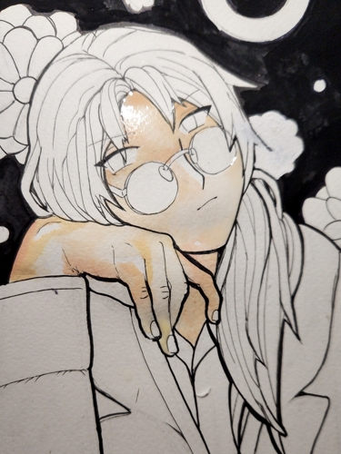
When shading the skin in layers, I went “down” using the neutral tint and the cool red. I tried to make the values appropriately dark.
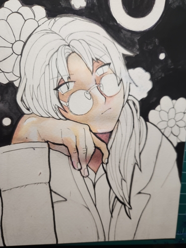
His hair was much easier. I decided his hair would be beige-blonde. The light yellow hair would pop against the black as opposed to the gray, and I already had the warm colors on my mixing plate. I saturated his hair with water and painted out from the shadows. His undershirt was next. Most artwork of Souichi shows him with a green or greenish shirt. I put my own spin on it and used the pretty turquoise paint I got. Straightforward. The white lab coat needed to be shaded. I mixed warm blue, the turquoise, and the nuetral tint for some shadows.
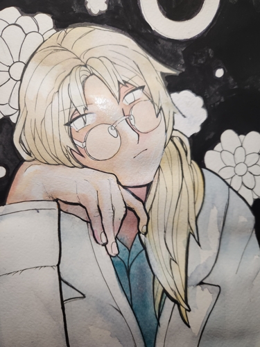
At this point I could already see where the color scheme was going. Souichi’s hair and skin were washed out yellows-oranges-reds. Very neutral. We also have turquoise. I made the background flowers and donuts pop with yellow to try to lead the eye around. I also tried to make the biggest flower a pretty red too. The colors leaked onto the Souichi, but I thought it looked like cool reflected light. I’m mentally pretending it’s intentional. I painted over the flower with the white-out over it too with some very very cheap old acrylic paint. I made Souichi’s eyes pop with yellow.
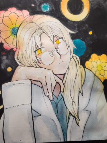
I had this idea to draw the red string of fate in the background! I thought the red line would look cool artistically but also add some meaning into the artwork if you’re familiar with the series.
First, I used colored pencils to draw out the red string. The brand I use is Prismacolor. From a set I got in high school! I have a lot of old art supplies. ANYWAYS, I got some old red acrylic paint and dragged it around the background to make the string. It wasn’t a big deal to be too messy with the paint or pencil since I could clean up with the turbo black. Hopefully the string is positioned appropriately.
All that was left was to clean up. Aka, re-ink faded lines, go in with colored pencil, etc. I added some magenta shadows in his skin to contrast with the turquoise shirt. Hope that looks cool.
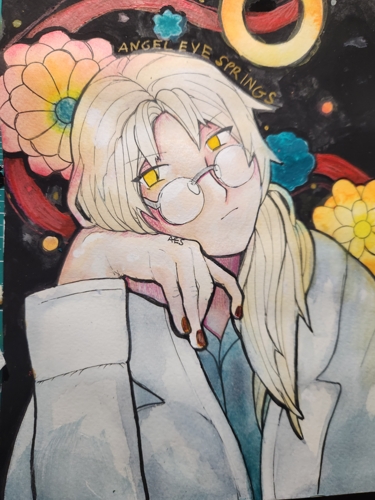
Here is the almost finished result!!! I still need to scan it in.
There’s two changes I want to make. His fingernails need to be white again. I made them yellow originally, but that led the eyes down. I scribbled them in with black which is better… except it makes no sense for Souichi to have painted fingernails like this! I was just trying to be artsy. *Sigh* Back to white.
The second is adding some red to the center of the right flower. I think that would make it look better at continue the string in a way. Plus the outer ring of the left flower looks sooo pretty.
SOOO *Simply Nailogical voice* what do you think?! What are some obvious things I’m missing that could be improved with my art? What about my “process”? I still need to scan and crop him, but I’m happy with my Souichi art! For now. There’s a lot to improve. But that’s for reading!!!